CONTOURS PRESENTS
Interview - Don Placek
Featuring responses from Don Placek. Photographed by Noah Jurik. Edited by William Watt.
In an industry that has shifted away from tradition in recent years, Don Placek is emerging as a quiet champion of the game’s roots – a designer and cartographer who doesn’t just map golf courses; he paints their souls. His cyanotype maps are more than geographical renderings; they’re brushstrokes of nostalgia and reverence. And his work doesn’t stop at the canvas. Placek’s early years as a caddie served as his crucible, forging his understanding of golf from a player’s perspective and informing his design approach with Renaissance golf ever since. We also discuss the Emoji Scoring System – a whimsical deviation from the solemnity of scorecards. Placek suggests that golf can offer a language of its own, one that speaks in smiles, winks, and tears of joy.
Contours: It’s an interesting dynamic, one person on coffee, the other on beer.
Don Placek: Yeah. They’re both important, but the timing of the two is really critical.
So, prior to golf, what was your first introduction to visual arts?
It really started early on for me, I was really lucky. I grew up with my mom and dad constantly encouraging my two younger sisters and I to just try everything. You never know what’ll be interesting and you really never know what you’re good at, and that remains the case today. My mom was a school teacher and my dad was a golf professional. So the golf part came from my dad, and my mom always had access to a Big Chief tablet, a new box of crayons, and all those things that you need when you just want to learn.
Then Christmas would come, and maybe I’d get some pastels from Santa Claus, or I’d get a new box of pencils and charcoal, and I got to try it all. I was inspired by a blank page and thinking up something to draw – it didn’t matter to me what it was. The golf part just became more and more prominent in my life as I began to play the game. Over time, the two things just kind of married themselves together. My parents just encouraged all of us to just try everything at least once. They didn’t have much luck with me eating vegetables, but as far as drawing on paper and pad and canvas, that definitely resonated.
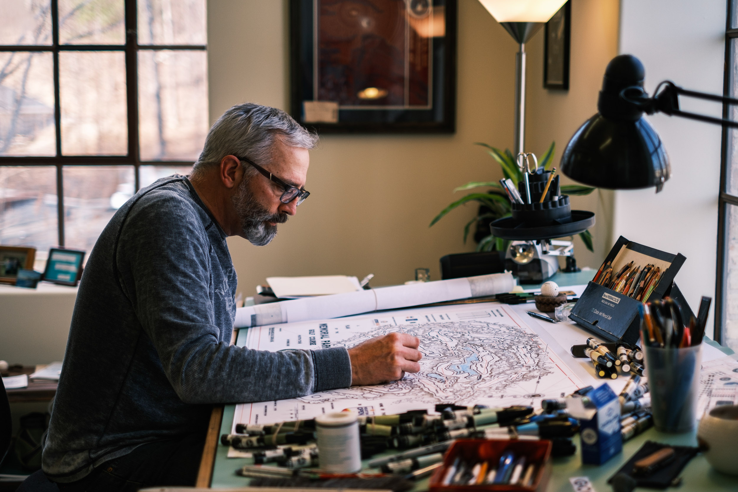

I’ve got an 18-month-old son who is just entering that phase where we’re trying to figure out what he’s interested in. Just this week, I discovered a band called ‘Hermanos Gutierrez’, a guitar duo originally out of Ecuador. And to my surprise, he loves them, and has become obsessed with guitar music. He only says a few dozen words, and ‘guitar’ is the most prominent of them. We’ve dug out my wife’s guitar and he can strum away on that along with them – we want to encourage him to explore that as much as he wants.
Couldn’t agree with you more, and what a lovely gift that music is. I mean, that’s something I share with my colleagues and has been a big part of my life. Anytime I’m drawing, there’s always some music on, and it goes back to my parents again. My dad listened to the Moody Blues and Johnny Cash, and threw in some Barry Manilow. Just being around it, you almost become part of what you’re exposed to, and that’s why it’s so important to expose young people to as much as you can, because of that power. It almost happens by default in some ways, but good for you. Your young son is in good hands.
Funny you mention Johnny Cash – I’ve been listening to Rick Rubin’s book “The Creative Act” recently – I’m not sure if you’ve come across it?
As it turns out I have a copy right here on my desk! It’s fantastic, isn’t it?
Yes. There are so many nuggets in there that immediately resonate, as if I already knew that but had never heard it put so clearly before.
It’s really, really well done. It’s fascinating what the creative process is, and even those people that we acknowledge as being powerfully creative, particularly in his area of musicians and singer songwriters that just… They get blocks too. Even the most creative people. Rick’s just trying to help them get out of their own way in a lot of ways. It’s an amazing book – it’s one of those you can pick up and just open up to any page and start reading and there’s something for you.
For me it speaks to the relationship between being creative and the spirituality of golf. We are trying to design and realise golf holes that will inspire people to play and try shots they haven’t before. We want them to have to overcome challenges, get themselves out of trouble, recover and sometimes even fail. And to do that, it is a creative and fluid process. The more comfortable you get with that, and not be too structured or rigid in your processes, the better job you’re able to do.
Interesting – I hadn’t really thought about how that book might apply in your field of golf course design and the visual work you do. One of the concepts of the book that I really like is it takes a bit of the pressure off as a creative person by talking about the fact that a lot of these ideas are just floating around in the ether or whatever you want to call it. They’re quite mysterious in a way, but they come and they go, and you don’t necessarily have to feel that everything you create has to be completely original, dug out from your soul. You can draw on those things that are around you and let it flow – you are almost just someone who is there to deliver that idea. Do you think that is what’s happening with the resurgence in the interest and implementation of high quality golf course architecture at the moment?
I think it’s certainly a component of it. Also the iconic books by Alistair McKenzie, AW Tillinghast, George Thomas and others are just more accessible. Today, you can get a dozen books that are really pertinent, and that anyone who’s interested in golf course architecture not only should read, but would really enjoy. You can get them on Amazon for $15 in paperback now, whereas 25 years ago there were maybe 100 copies of the hardback version – they were almost antiques and you just couldn’t get your mitts on them.
Couple that with what drone photography has done for golf architecture – just being able to convey what a golf course is really clearly and beautifully. When I grew up, it was only really the World Atlas of Golf that had an axonometric view. The idea was you could really get a feel for what was going on overall, especially with routings and seeing how a routing took advantage of a property. How could the routing tour you around the property to show you not just 18 holes of golf, but hopefully what the land was like, what the vegetation was like, and what you could see looking offsite, which never shows up in a plan view drawing anywhere.
So it seems like all the planets have aligned themselves for people to not just discover this interest but really pursue it. There’s been a core number of people that have always had an appetite for golf architecture, but I think it’s doubled, or tripled, or quadrupled in a really short period of time, and that’s exciting.
”There's been a core number of people that have always had an appetite for golf architecture, but I think it's doubled, or tripled, or quadrupled in a really short period of time, and that's exciting.
Don PlacekGolf Course Architect
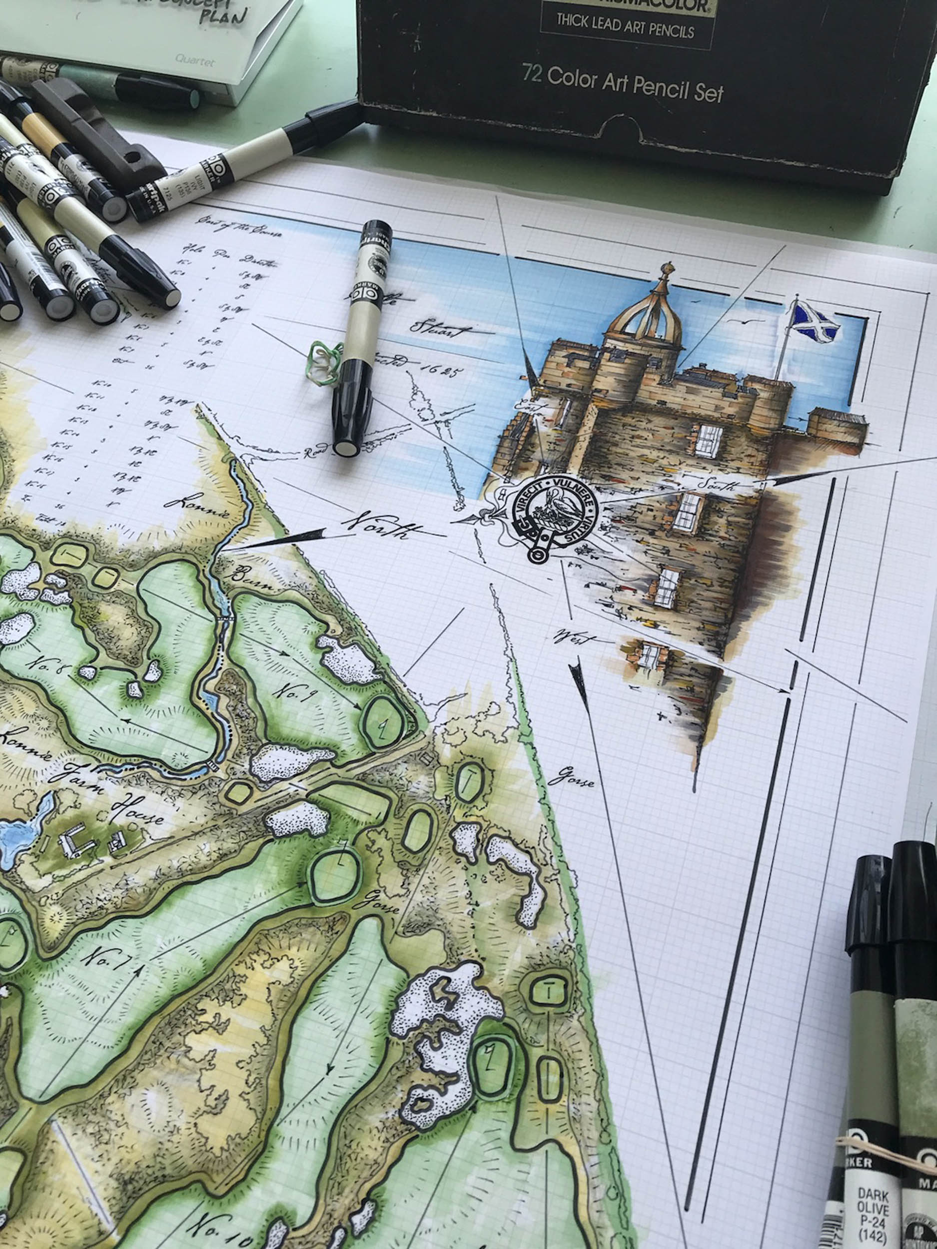
Can you talk us through the use of cyanotype in your plans?
I’ve always been interested in map making. There’s just something about following an 18-hole routing in a map that’s almost like a treasure map. Where does it lead you? What’s next? Do you go here next, or over there?
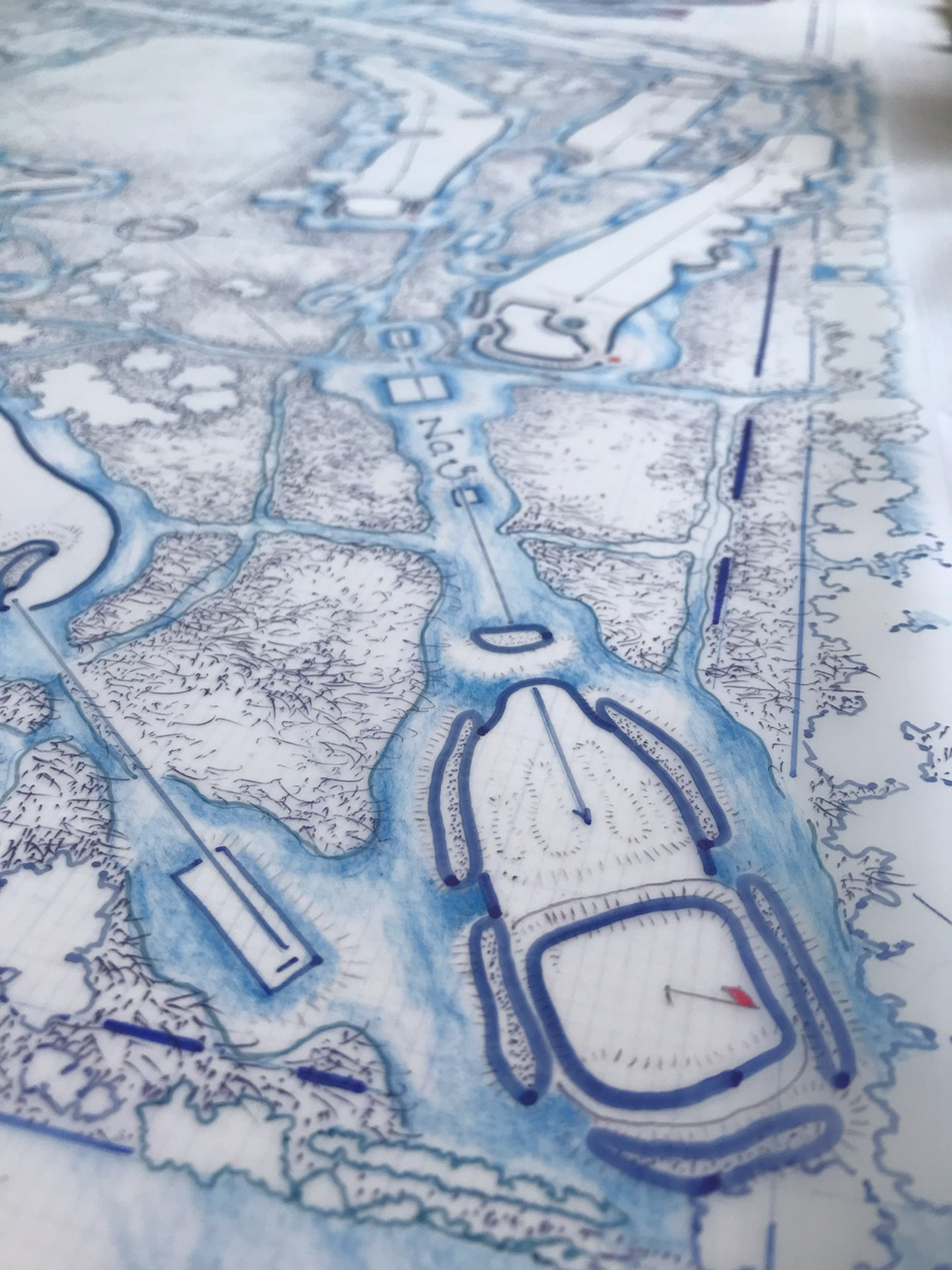
The cyanotype is an early photography technique developed in the late 1840s and ’50s by Sir John Herschel and was really one of the first ways to make prints.
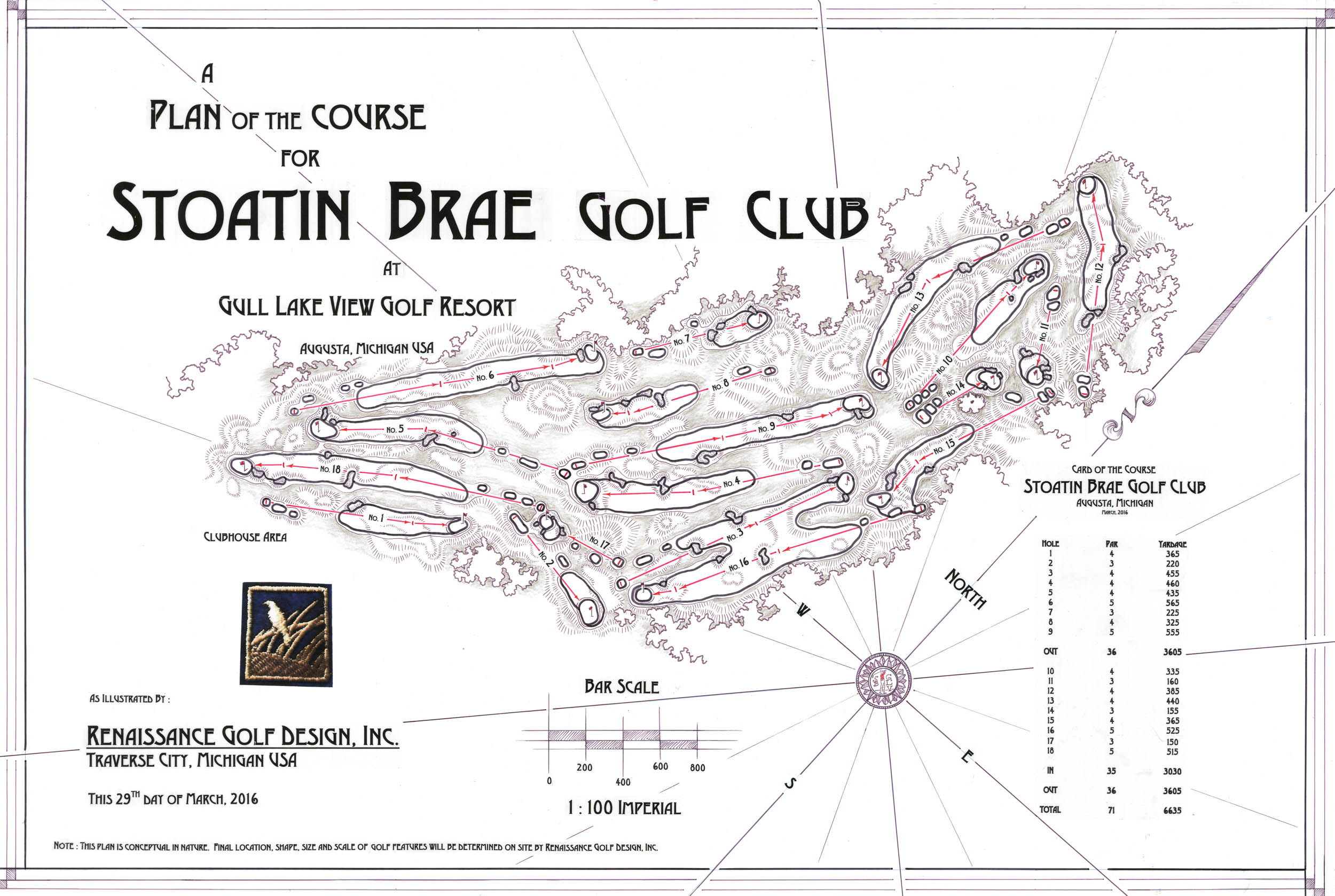
It was a reverse reading. The natural background was this really deep denim, hued sky blue with a white contrast of line work. And for the work I do, it’s all about the contrast – that’s what really gets your attention and draws your eye. And it happens that cyanotype was state of the art during the golden age of golf design, so it was used as part of the design process of many famous golf course designs.
Today, we use it more to convey a feeling of vintage – as with anything, what’s old is new again. It doesn’t matter if it’s clothes or music or cars, whatever. Again, golf is no exception. It really speaks to me too because I think so much of the time I’ve been at Renaissance and all the fellas that I’ve had the great pleasure to work with, we’re always trying to age stuff quickly, especially out in the field.
We want it to look like it’s been there a really long time, and we want to cover our tracks. We don’t want to leave any evidence that it was built – it was more found. This idea just translates to the drawings too. We want to make them feel found.
So just going backwards and really studying how things were done is really why the cyanotype drawing I think resonates with me. I guess it’s got a little of that treasure map feel to it as well.
It is also worth mentioning that a plan is a jumping off point. Sometimes they’re really just a beginning. They’re a stepping stone to what gets built. We feel strongly that the best stuff was done when people had to be creative and didn’t have the physical resources or the money to make big changes to the property that was going to become golf. So they had to figure out ways to do it without the muscle of earth moving equipment, and do it in a way that could be maintained at a number that made sense. So our plans are not prescriptive.
Could you take me through your creative process and some of the layering that goes into the final artwork?
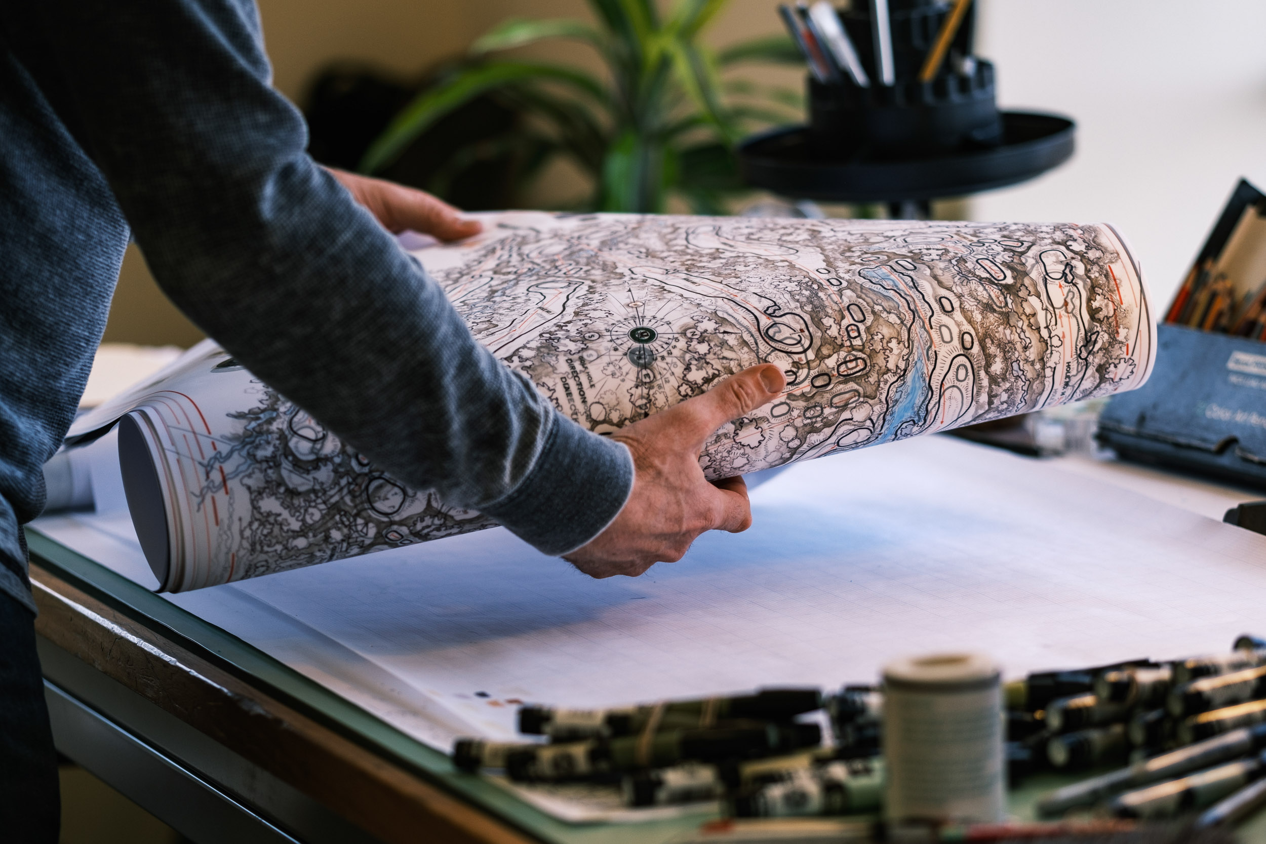
Layering is the key word. It’s a layered process because most of the work I do, I do in pencil first and conjure the ideas in quite a free way. I try to figure out the context, the style, the composition, and orient the plan in a way that’s a little more interesting than just north always being up.
From there my favourite medium to use is ink on Mylar. It is really versatile and it allows you to take your back of the napkin sketchbook idea and put it into a more permanent form, going from pencil to ink. Because the Mylar is a transparent material, it drinks in the ink and really hangs onto it in a way that paper does not. I just love ink. I love the smell of it. I love how it adheres to the Mylar. I like the durability of it. It’s as close to archival as you can get with something that you create with your hand.
Way back in the day, 30 years ago when I worked for the Dye family when I was still in college, we were doing all that work by hand using Mylar. And it’s just always appealed to me ever since. I love working with it.
Once you’ve created those layers and built up your drawing, is it then a high resolution scan that you go through, and is there any kind of post-production that then occurs?
Over the years I’ve learned that anytime you’re going to reproduce something in any kind of quantity, is that if you start large and reduce it down, it gets tighter, cleaner, and easier on the eyes. So I tend to draw well outside of whatever the intended proportions are going to be.
So if you’re looking to create something at 8 x 10, I’ve probably started with it at more like 24 x 36. That way when it gets reproduced, it holds its detail and it doesn’t get grainy or foggy or melt away. So that larger original work will go into a high resolution digital scan that is then the main file we work off. That digital file can then be used in whatever form we would like to promote the project, or the golf course or the club. The great part is these days, once you have a quality image, it’s limitless what you can do with it. You can put it on a towel, a golf bag, a piece of clothing. It can be a mural on a wall or a five by seven postcard and everything in between. If you start with something that can be reinterpreted in many different ways, and it’s a quality piece to begin with, you can go in many directions.
The client that commissioned the work usually gets the original, and we will get that physically delivered to them. They often want to have the one thing that no one else has, or it’s different in its own unique way, and it allows the client to do that.
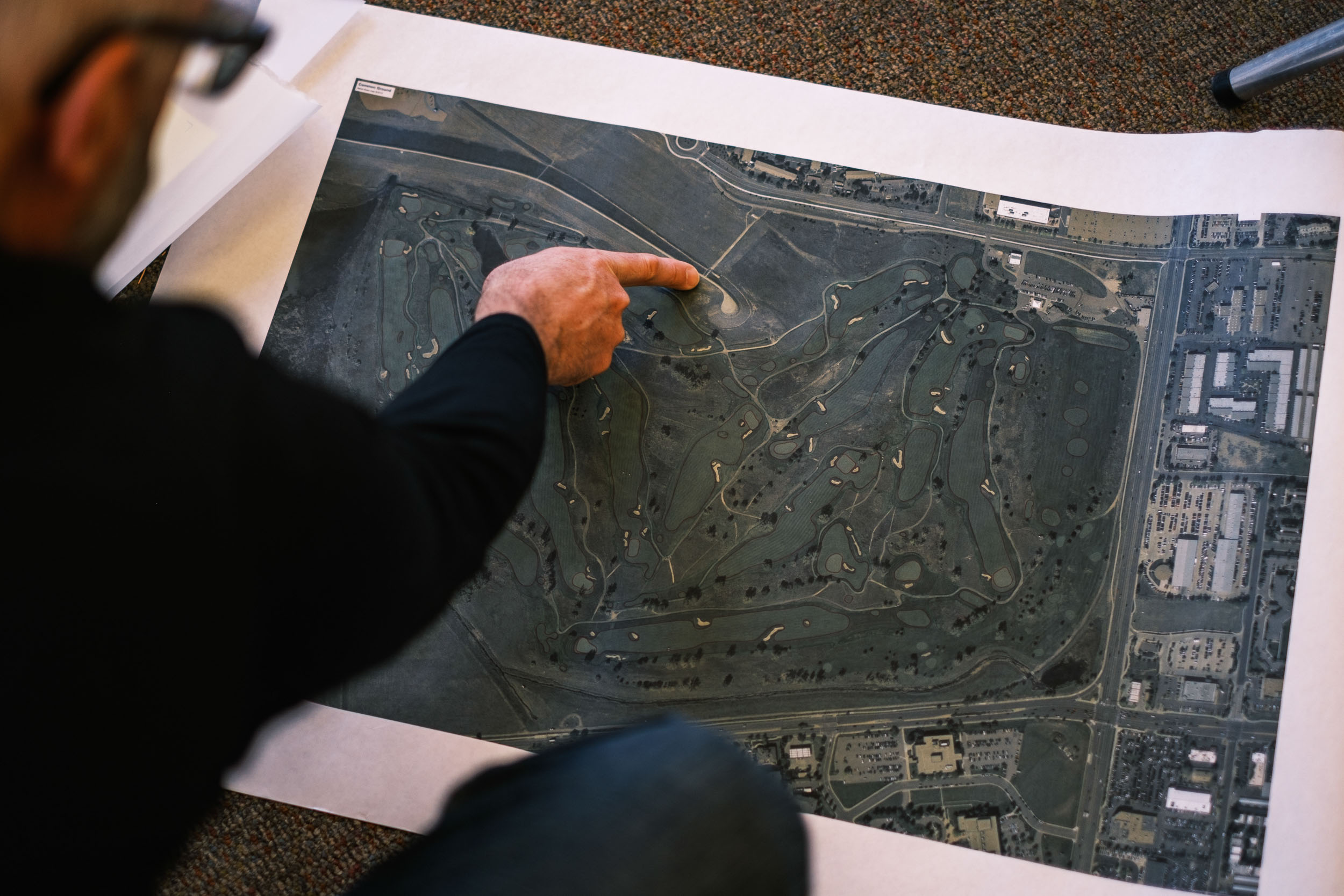

You mentioned that the artwork is really a stepping off point for the way that Renaissance works. Does it ever get to a point where there are so many changes on the ground that you think – I might have to redraw this map?
In the early days and working for Tom [Doak], there was always this balance we were trying to strike between presenting something to a client at the beginning of a project. It couldn’t be too detailed, because if it changes significantly during the process, people might think either we didn’t do a good enough job planning, or that we didn’t know what we were doing at the start. So yes, we had to be cognizant of the idea that you don’t want to get too detailed too early.
Today though, Renaissance has been doing it our way long enough now that the clients that we’re lucky enough to have are more savvy. They understand how we work.
One of the most fascinating things that I’m involved in now is doing course guides for clubs after the course has been built. And you can see very clearly how different the hole ends up being realised in the field than it was conceptually at the beginning. Creating a golf hole is not unlike making a painting – you keep doing it until it’s right. Sometimes it’s a very quick process, and other times it takes an awful long time.
Some of the overhead views of the stuff we’ve done lately as it’s realised and grassed, it’s just wild to see the different forms that take shape. A lot of that is because, more so than ever, we are trying to hide the grassing lines, those transitions from fairway to rough or native areas, behind soft contours, so that your eye is not distracted. It allows the golfer to really pay attention to the way the ground moves, not where the grass starts and starts and stops.
Can you tell me a little about your days as a caddie, and how that experience affected the way you see golf today?
Caddying was a huge part of my life. I was very fortunate to receive an Eisenhower Evans Caddie Scholarship to the University of Colorado in Boulder, which paid my way for four years of school. I lived in a house with 55 other caddies who were in the same financial situation that I was. It was fantastic, and I’m really grateful for that experience to this day.
I learned a lot. If I have any people skills, well I learned a lot of my people skills from my parents and my family. But you also learn them when you get a loop and you’re standing on the first tee about to work for somebody for four or five hours that you’ve never met before. You don’t know how good they are at golf. You don’t know how they play. You don’t know what their expectations are.
It’s wildly interesting. Everyday is a job interview for a job where you don’t even know what the requirements are. So you figure it out as you go, and you learn to take in quickly what your player is really after that day. Some people don’t want you to say a word. Other people want oceans of information. It’s this really interesting human interaction, and it is life skill building.
Then figuring out how to get somebody around the golf course, hopefully playing maybe a little better than they would have otherwise, is the goal. You want to make the game fun, and playing well is a lot more fun than not. So anything you can do to help your player save a shot here and there, find a ball they didn’t think they were going to. All those little things add up. It’s a group of little gifts that you’re giving to somebody.
It also helps you realise people hit the ball an infinite number of ways. They’ll hit it sideways, and on the rare occasion, even backwards, somehow. And that’s really important as an architect to bear in mind. You can get caught up on certain types of shots and things you want to offer up or challenge, but gosh, everybody hits it everywhere.
The more you can keep someone in the game, which is really what you’re doing as a caddie too, that’s when golf is really fun. There’s nothing more demoralising than being out of play two seconds after you just started a brand new hole. You just want to be in play off the tee.
If you can help your player as a caddie do that consistently, they’re going to have way more fun. We try and design golf holes that challenge you certainly, but keeping as many people in the game for as long as you can, that’s important too. It’s probably one of the things I learned from caddying and then again working with Tom and the fellows, that’s really important to us.
What is ‘The Emoji Scoring System’?
When I first met my lovely wife, Elizabeth, we talked about golf and that I was in the business of golf design and her face just sunk. I could see her thinking, “Oh no, I can’t play golf very well, this might not go very well” kind of thing. She said, “I have to be honest with you. Here’s how I play golf. If I hit a good shot or have a good hole, I draw a happy face on the card. And if I don’t, I draw a sad face. Sometimes I’ll draw a confused face. And maybe the happy face isn’t because I had a good score, but because I hit one really good shot on that hole.” From that point on, I knew this woman could be for me, because she’s just making golf fun.
Golf is hard. It’s hard to play well for 18 consecutive holes and string 18 good holes together. The emoji scoring system immediately takes the seriousness out of it and just settles you quickly. It’s a great way to introduce people to the game – you want to make that really good first impression. It goes hand in hand with the real attention short courses are now getting – it’s more manageable because it’s more fun. And boy, is fun critical.
The emoji scoring really just focuses on what’s important – enjoyment, comradery and being outside and all the other great things about the game. At Old Barnwell, South Carolina, the idea of using the emoji scorecard for the kids course has been kicked around. I love the idea because when you can introduce someone at an early age to the game, where they can grasp it and then travel with it the rest of their lives, you’re really giving them a gift. Golf is one of the greatest gifts you can give to a young person. And if it’s fun, you have a much better chance of them giving it a whirl.
I hope it takes off and we see the emoji scorecard become something that, as you say, junior golfers can use to introduce themselves to the game and take some of that pressure off that initial experience with the game. I remember playing when I was young and there was that you’d get down on yourself and you’d get annoyed, and there’s just no need for that really.
Right. It’s human, but the quicker you can get out of your own way, the more fun you’ll have. It’s part of growing up, I think. We’ve got this special opportunity with such a global focus on golf at the moment, and if we can send out the right message to everybody, the game has got a great chance of being around for a lot longer.

Thanks Don, it was a pleasure to talk to you.
I’m so excited with what you’re doing with Contours. It’s really fresh and it’s just so easy on the eyes and visually compelling.
Oh, thanks, man. That means a lot coming from you as we look to find our footing here. It’s been a really good time to have that Rick Rubin book [The Creative Act] we discussed going through my ears, and encouraging me to focus on just creating the stuff that I want to create, and not worry too much about everything else.
Absolutely. I’m working on a project for Chicago Golf Club for their course history, and we’re trying to distil the essence of the template holes. What is the essence of the Redan, the Biarritz, the Short, the Eden, the Cape. What is the core idea of each one, in its most simplistic form? I’ve got a quote in here from the book that I’ll leave you with.
Making the simple, complicated is commonplace. But making the complicated simple, awesomely simple, that’s creativity.
Charles Mingus, from The Creative Act by Rick Rubin
Photography of Don’s studio supplied by the talented Noah Jurik. Original artworks by Don Placek.


Don is a true artist who seeks and understands the soul of the game and what resonates within us.